Zero to production: How I design from Terminal, without Figma
I'm a product designer. I've been designing from the terminal for a while now. Multiple projects, no Figma. This time I documented the whole process. A complete landing page with a design system, mobile responsiveness, and animated components. Built entirely from the command line.
See the live result: signal.ferilab.ai
This workflow makes me more efficient. I think, I speak, things happen. My brain moves faster than my hands ever could in a design tool. No dragging layers. No nudging frames. Just decisions, one after another. The terminal lets me work as an art director. I direct the vision, the details, the quality. The AI handles the production.
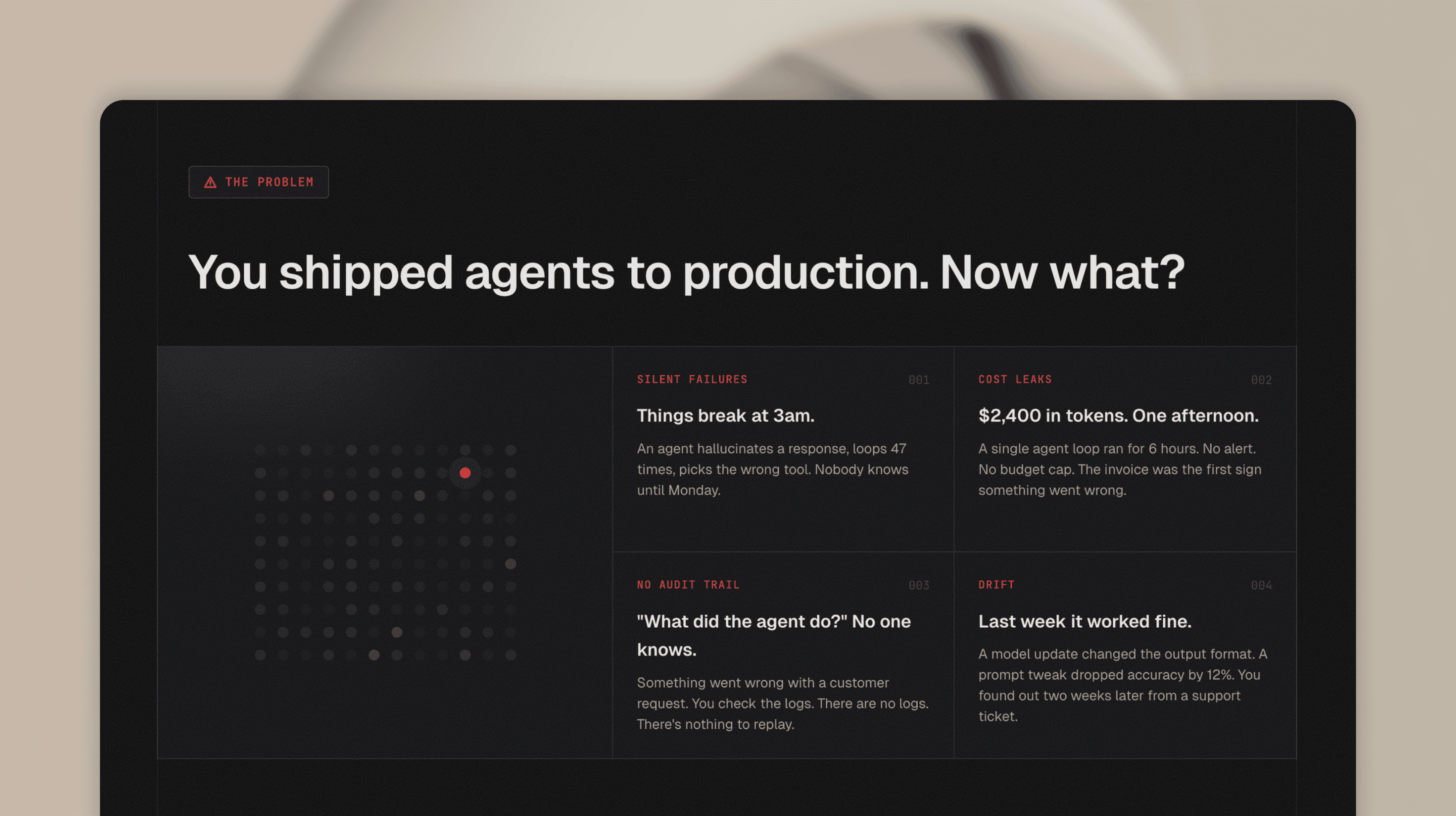
The problem with two sources of truth
Most designers already use AI tools. Cursor, Claude, Codex. They build sites from their Figma designs. And that works. Starting in Figma isn't wrong. It's a proven process that delivers great results.
But it's still two steps. Design in Figma, then translate to code. Two files. Two sources of truth. Every iteration means going back to the design file, adjusting, then re-building in code. Alignment fixes. Pixel-perfect modifications. Spacing tweaks that take 30 seconds in code but require opening Figma, finding the frame, nudging, exporting, comparing.
Some designers have started questioning this. What if you could collapse the whole process into one step? Start in terminal, design in code, iterate in the browser.
I'm one of them. Here's how I work.
The setup: weaponizing constraints
Before I write a single line of code, I arm myself with rules.
I use Claude Code in Ghostty, a terminal I picked for its simplicity. Multiple tabs, no clutter, stays out of the way. But the AI isn't freestyling. It works inside a system I built.
The foundation is a file called CLAUDE.md. But it's not just one file. I use a layered system. Global rules that apply to every project. Then project-level rules that define the design system. The AI loads all layers automatically. No guessing. No hallucinating random hex values.
The project rules don't duplicate token values. They point to the source files. One place to update, zero drift.
~/.claude/CLAUDE.md              ← Global rules
├── Git workflow, pre-commit hooks
├── Code quality, secrets protection
└── No duplication — reference, don't copy

~/dev/CLAUDE.md                  ← Dev-wide rules
├── File organization
└── Code style, modular design

~/dev/project/CLAUDE.md          ← Project rules
├── Design system constraints
├── Component patterns
└── → tokens/TOKENS.md (source of truth)
Here are some of the rules from the Signal page:
- No hardcoded colors. Every value must use a design token.
- No arbitrary spacing. Everything on a
4pxgrid. - Strict font roles. Geist for headings and UI. JetBrains Mono for labels and code only.
- Use shared components. Never rebuild what already exists.
- Only define what's used. No speculative tokens or components.
But rules alone aren't enough. I also define the design system before any UI exists.
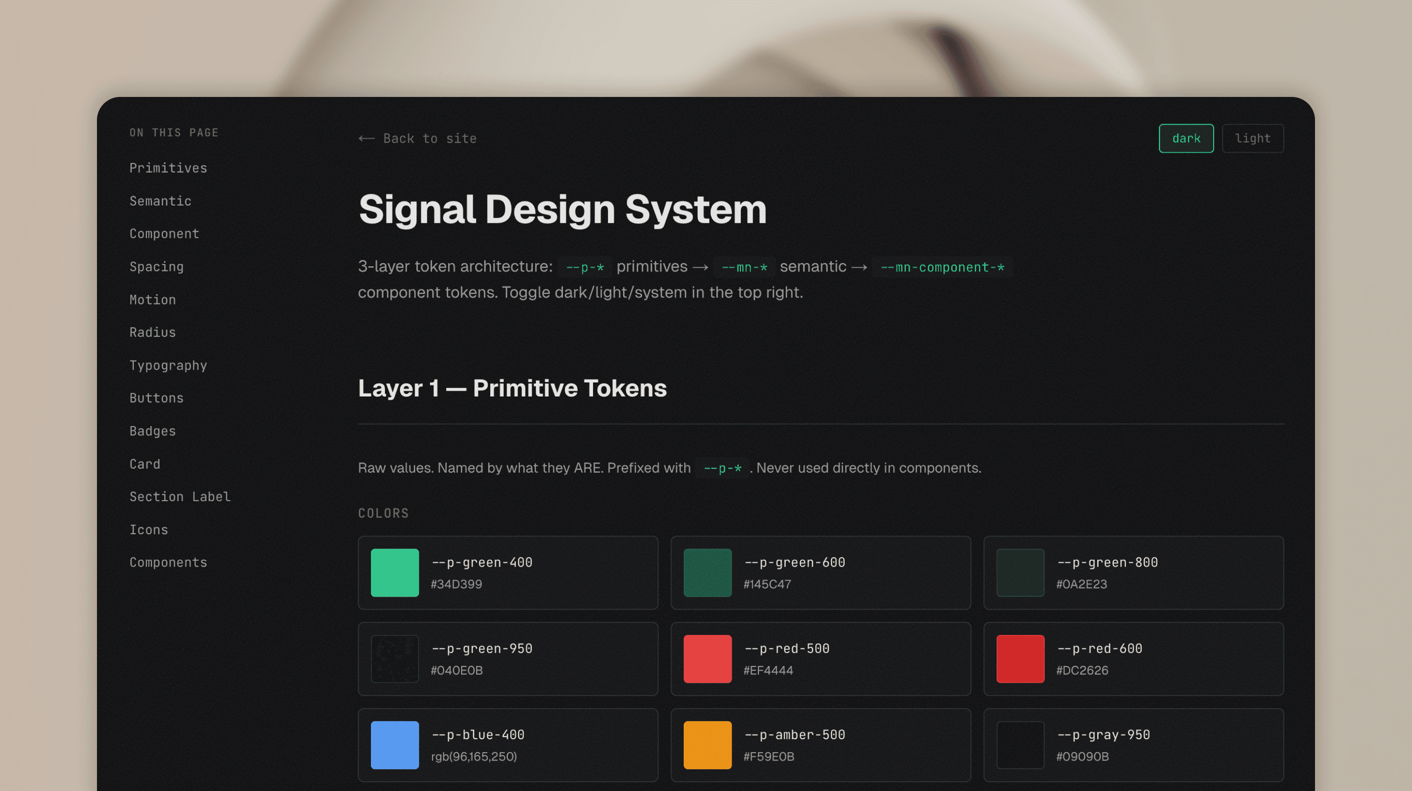
Tokens. Variables. Spacing scale. Color palette. Typography. All written in code, not in a Figma file. A 3-layer architecture:
- Primitives: raw values.
--p-green-400,--p-gray-950. Named by what they are. - Semantic: contextual meaning.
--mn-text,--mn-card,--mn-accent. Named by what they mean. These switch between dark and light themes. - Component: specific usage.
--mn-button-radius,--mn-card-padding. Named by where they're used.
The Signal page ships dark only, but the token layer is built to support theming if a future project needs it. When the AI starts building, every element already has a home. It picks from the system. It doesn't invent.
Then I layer on automation. This is where it gets interesting.
A pre-commit hook blocks any git commit that fails typecheck or lint. The AI can't ship broken code. Period.
A design auditor agent scans for hardcoded colors, spacing values that don't match tokens, font families that break the system rules.
A contrast checker validates WCAG accessibility on every color combination.
A doc-sync hook runs after every commit and flags when documentation references files that were deleted or moved.
Even my project management tool has a guard. Linear issues can't be marked "Done" without my explicit confirmation. The AI has to wait for me to say "tested" or "works" before closing anything.
This isn't over-engineering. This is how you make AI reliable. Constrain it, give it a system, automate the checks. Then trust the output.
Plan before you build
Before writing any code, I start in plan mode. First the story: what is this product, who is it for, what does the page need to communicate. For Signal, I designed a fictional observability tool for AI agents and worked through the narrative. What problem does it solve. How does it work. Why should someone care.
Then the technical plan: section order, component structure, what can be shared, what needs to be custom. The AI proposes an approach, I review it, adjust, and only then switch to implementation.
Starting from scratch
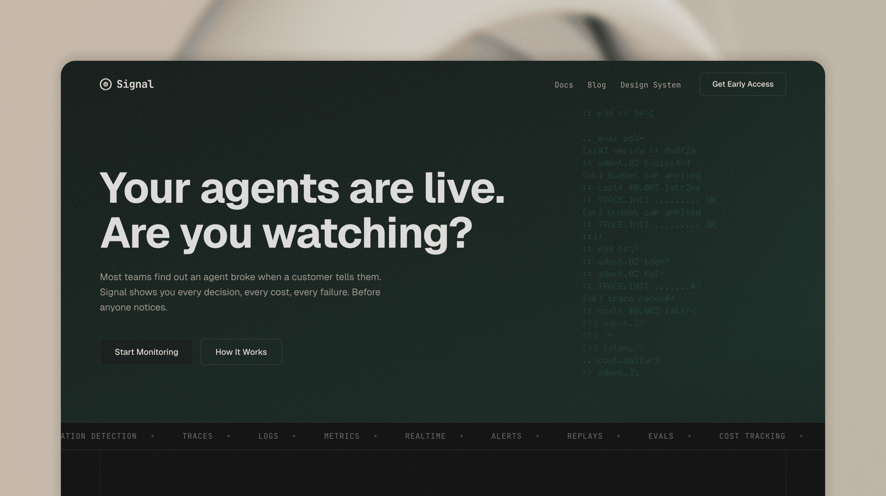
Day one. Empty folder. No mockups. No wireframes. The idea was a fictional product called Signal: an observability tool for AI agents. Dark, developer-focused, minimal. Next.js, TypeScript, Tailwind.
The first thing I wrote wasn't code. It was the CLAUDE.md. Design principles in plain text:
- Dark background, near-black
#09090B - Green hero section with teal gradient
- JetBrains Mono for accents, system font for everything else
- Minimal border radius.
4px,6px,8px. Nothing rounded. - Editorial vertical lines on section edges
From these lines, the AI built the first version. A landing page that matched the vision I described in words.
Tokens first, not pixels
Most designers think in pixels. I think in tokens.
Before building any section, I defined the color system. Not in a color picker. I started with references. Screenshots, mood boards, sites I liked the feel of. Dark interfaces with high contrast. Terminal aesthetics. From those references I pulled a direction: near-black backgrounds, white text with varying opacity levels, a single accent color for highlights.
Then I translated that direction into CSS variables:
--mn-bg: #09090B
--mn-card: #111113
--mn-text: rgba(255, 255, 255, 0.92)
--mn-accent: #EF4444
Then spacing. A 4px grid from 4px to 96px. Then radius. Three values only: 4px, 6px, 8px.
This took maybe 20 minutes. But it saved hours. Every component built after this point had consistent spacing, consistent colors, consistent radii. No drift. No "which gray is this?" moments.
When I later restructured this into a proper 3-layer token system (primitives, semantic, component), the refactor took one session. Because the foundation was clean from the start.
The iteration loop
This is where the terminal workflow really shines.
The loop is simple:
- I describe what I want.
- The AI builds it.
- I take a screenshot and paste it back.
- I say what's wrong.
- The AI fixes it.
- Repeat.
No context switching. No "let me update the Figma file first." No exporting assets. The browser IS the design tool. The terminal IS the design software.
Here's a real example from the build. I was working on the dashboard section. The agent rows had an animation where they appeared one by one with a typewriter effect. But the container height was jumping as each row appeared.
I pasted a screenshot. Said "I don't want to see any jumping lines, this is a very bad pattern." The AI changed the approach: render all rows from the start with visibility hidden, so the container has its final height from the first frame. Fixed in 30 seconds. And the AI stores that feedback as a rule. "No layout shifts. No jumping containers." Next time it builds an animation, it already knows. I don't have to repeat myself. The constraints grow with every session.
Another example. The FAQ section. I opened an item and the answer area had no top padding. I pasted a screenshot. "Need same top padding what we have at the bottom." Fixed. One line of CSS.
This isn't about being faster than Figma. Figma with components and AI code generation is fast too. The difference is there's one source of truth. When I fix spacing in the browser, it's fixed. There's no design file to update. No drift between what the mockup shows and what the code does. You see the real thing in a real browser. You give real feedback. You get real fixes. What I see is what ships.
Building up
After all that planning, the AI generated the full page layout with all sections. Hero, problem cards, dashboard, features, stats, testimonials, CTA, footer. Not from a one-line prompt. From the story, the structure, and the constraints I'd already defined. That upfront work is what made the first draft good enough to build on.
Then I started refining. Some sections got removed. New ones got added. I went through each section one by one. Reviewed in the browser, gave feedback, iterated until it felt right. Step by step, the page took shape.
Mobile responsiveness was baked in from the start. The frontend skill I use includes responsive breakpoints and mobile-first patterns. So the initial layout already handled different screen sizes. From there, I fine-tuned: resized the browser, spotted what needed adjusting, gave feedback. No separate mobile design file. No redesigning from scratch.
The dashboard section was the most exciting part. This is where the craft started. Animated agent rows with typewriter text, status dots with pulse animations, an investigation view with staggered trace replay, live counters in the footer. Every detail was intentional. Every interaction felt like real product design. All built iteratively, all working on mobile.
QA as a design tool
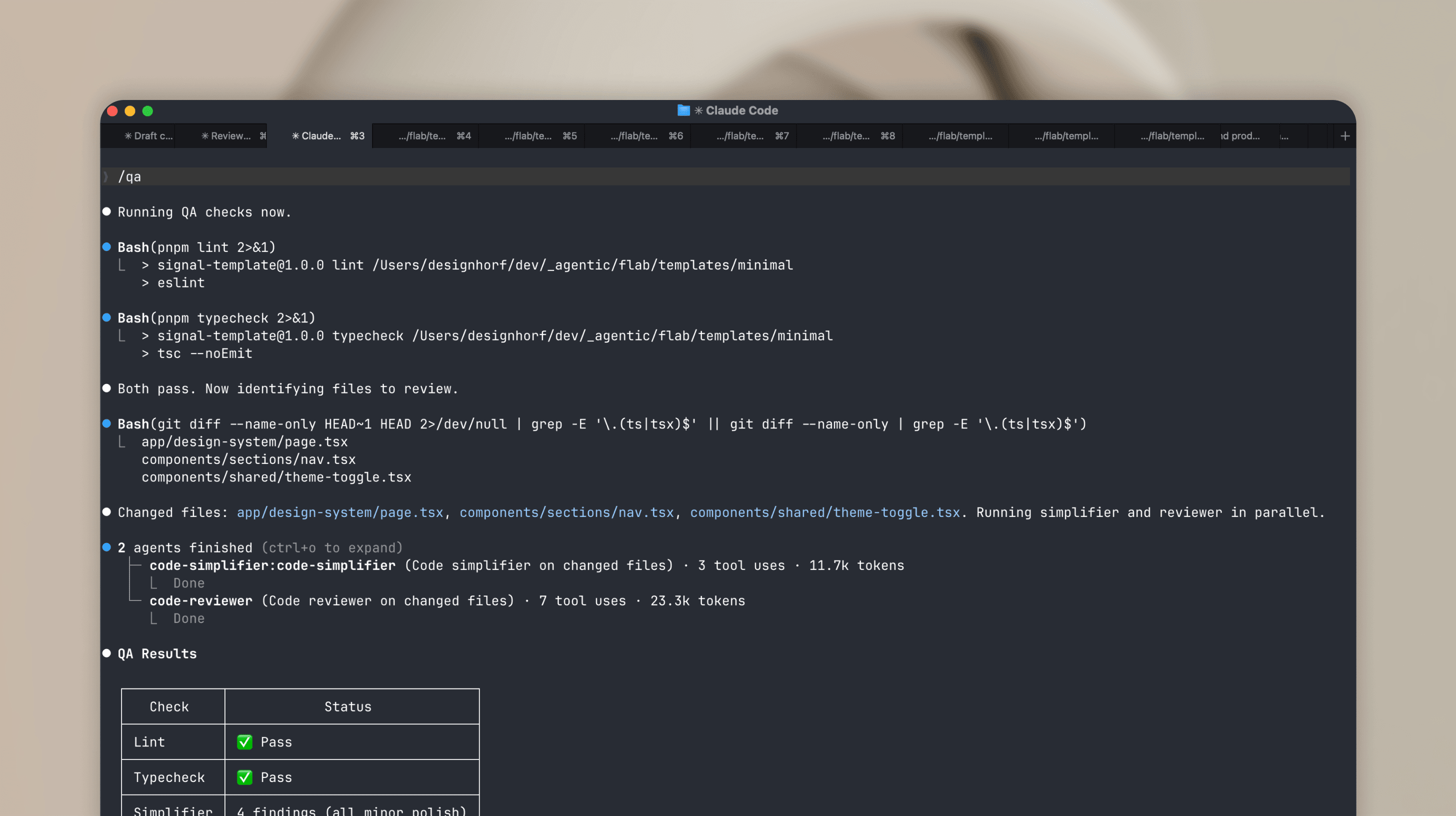
Here's something I didn't expect. Automated QA became a design tool.
I built a /qa command that runs lint, typecheck, code simplification, and code review in sequence. I ran it after every major feature. And it caught things I missed.
Duplicate CSS classes. Hardcoded colors that should have been tokens. Inline styles that broke the component pattern. A duplicate HTML id that would have broken anchor navigation. Timeout leaks in animation hooks. Unused imports. Accessibility gaps.
The design auditor agent found 25 hardcoded color values in one pass. The contrast checker validated WCAG AA compliance. The code reviewer scored the codebase and gave specific line-by-line feedback.
Figma has plugins for some of this. Contrast checkers, lint rules, accessibility audits. But code-level QA catches things a design file can't: unused imports, timeout leaks, duplicate IDs, token violations in actual CSS. Working in code means you catch these while building, not after shipping.
The design system emerged
I want to be clear about something. I didn't plan a massive design system upfront.
It grew from the work.
I started with flat CSS variables. Just colors and spacing in one :root block. As the page got more complex, I restructured into the 3-layer architecture. Primitives. Semantic. Component. Because I needed it, not because some best practice told me to.
Same with components. I didn't pre-build a Button component with 5 variants upfront. When I needed a button, I created the component. When I needed a second variant, I added it. The component grew with the project, not ahead of it.
The Card component? Created when I needed consistent card layouts across problem cards, step cards, and the design system page. Not before.
This is my core philosophy for 0-to-1 work. Only define what you use. No speculative tokens. No hypothetical components. Build what you need, when you need it. The foundation (tokens, spacing scale, radius) makes adding new elements fast when the time comes.
A few weeks from now, if this page needs a contact form, I'll add an input component then. Not now. That's not laziness. That's focus.
The result
The Signal page is live at signal.ferilab.ai.
What it includes:
- Full landing page with 12 sections
- Dark theme with polished visual identity
- Mobile-first responsive design with hamburger menu
- Animated dashboard with typewriter effects, status transitions, investigation view
- 3-layer design token architecture (50+ tokens)
- CVA-powered components (Button, Badge, Card)
- Design system page with sidebar navigation, live previews, and token reference
- Automated QA: lint, typecheck, contrast audit, token compliance
What it doesn't include:
- A Figma file.
What I learned after 6 months of terminal-first design
This workflow isn't for everything. It works best for:
- 0-to-1 projects where speed matters more than pixel perfection
- Developer-focused products where the designer understands code
- Templates and landing pages where the scope is clear
- Solo work or tiny teams where the Figma handoff step adds no value
It works less well for:
- Large design teams that need Figma as a shared language
- Complex product design with user research and multiple stakeholders
- Projects where non-technical people need to review designs
- Brand work where visual exploration needs to happen before code
The biggest thing I learned: constraints are the product. The CLAUDE.md file, the token system, the automated hooks. These aren't setup overhead. They're the actual design decisions. Every rule I wrote shaped the output more than any prompt I typed.
The AI is fast. But fast without direction is chaos. Fast with constraints is shipping.
One more thing. Figma isn't bad. It still has its place in the design process. But it's not the only way. Not for everyone, not for every project. I love experimenting, and looking back at the past 6 months, this whole terminal-first approach has evolved incredibly fast. And it's still evolving.